Why we like flowers-The new psychology of bright colors
Share
Each year, Brooklyn Botanical Gardens chooses the Greenest Block in Brooklyn. The judges find plots that residents transformed from dusty, grey cement into amazing flower gardens. The winning spaces are always community projects — where families came together to plant, water, and mulch in their free time.
The ethologist wouldn’t let us forget how dumbfounded a golden wheel spider would be that we plant flowers. But unlike the spider, who understands the world through vibrations, or the bat who understands the world through echolocation, or the hound who understands the world through smell, we use our eyes. We map the world by the colors and shapes we see.
You might have heard that dogs are less sensitive to color than we are (though it’s an exaggeration that they see only in black and white). They’re descended from a long line of carnivores, which means they feed themselves by detecting movement. They don’t need to pick out bright colors to survive. We, on the other hand, descended from omnivores. Like walking botanical almanacs, our ancestors fed themselves by correctly labeling fruits, flowers, and leaves. Color vision was absolutely necessary to that end.
Does that mean we like flowers because we like bright colors? Or, do we like bright colors because we like flowers? I’ll argue we’re drawn to both independently.
Early humans who liked flowers probably made more babies than those who didn’t. 500,000 years ago, a few nomadic hunter-gatherers had a gift: an odd fixation with flowers. All their peers were indifferent to flowers. But, as chance would have it, flowers appear on trees and bushes a few months before edible fruits and nuts show up. Animals that flocked to this bounty could be hunted and eaten too. So those flower-fixated nomads were lured into one food-rich environment after another. They ate like kings and produced many children. Meanwhile, their flower-indifferent cousins wandered into scrubbier landscapes, and they didn’t survive or reproduce very well. You know how the story ends. The flower-fixated group outbred the flower-indifferent group, and we’re all descended from the winners of that genetic face-off. We all have flower fixation in our genes.
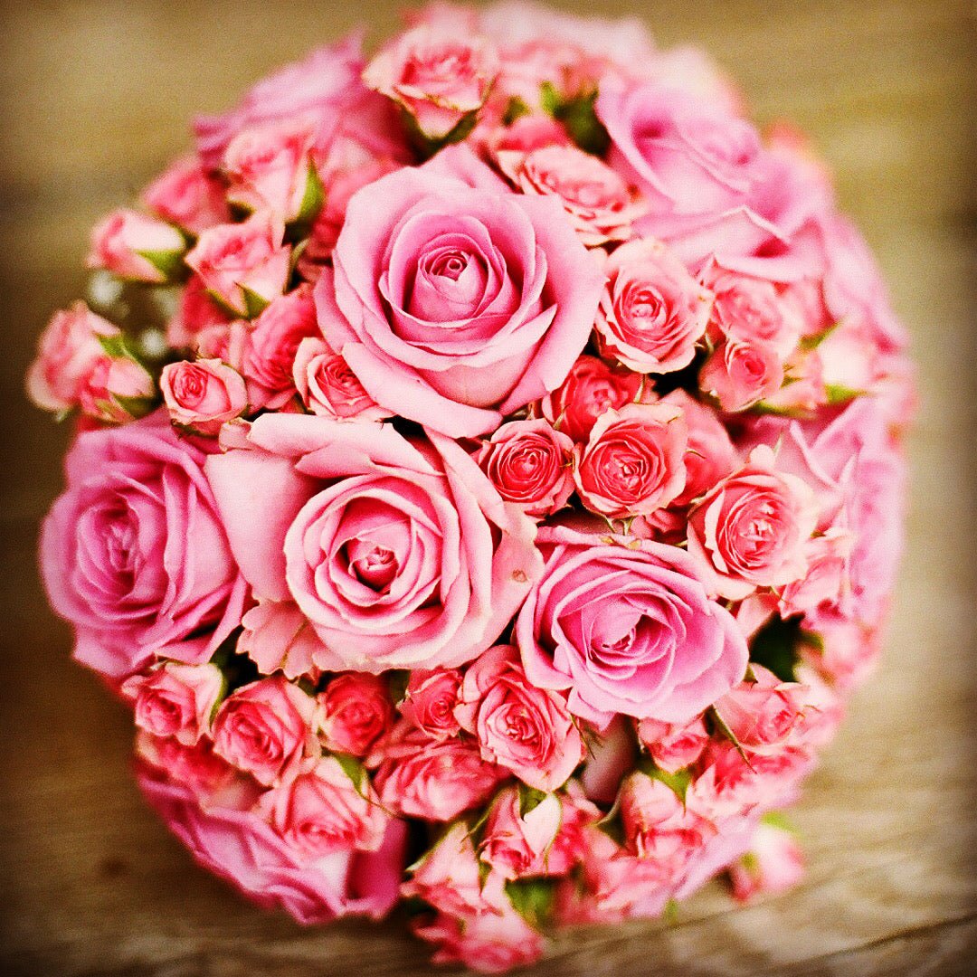
This story is an educated guess to why we love the color, shape and smell of flowers especially when someone we care express his feelings with such a delightful gesture of sending flowers!
Our attention goes to whatever stands out in our visual fields, be it glittery gold, luminescent fireflies, or bright red flowers. Flowers entice us in the way neon spinners entice fish. (By the way, fish were probably the first to evolve color vision).
But flowers aren’t the only colorful things we prize. Notice how many people adorn their homes and gardens with colored non-flowering plants, like red poinsettias, purple Persian shields, or red-purple Hawaiian ti plants.
Think of a forager in the jungle 500,000 years ago, who steps through a kaleidoscope of greens, greys, dull yellows and browns. Nothing he sees warrants much attention. However, if his visual field sweeps over something purple or electric red, he perks up. That bright red item probably means either “notice me” or “eat me.” He keeps his distance from a coral snake, but he fumbles through thick brush to get at patches of fruits and berries.
Bright colors attract us, so do dull colors put us off? One study by the Australian government said yes, and it named dark-brownish-yellow, Pantone 448C, less attention-grabbing than any other color. Another cross-cultural study by Stephen Palmer found the same. Thus, Australia decreed that cigarette packages must be wrapped in dark-brownish-yellow to dissuade citizens from smoking.
Pantone 448C was voted an unlovable color because it looks like excrement (strike one) and because it’s the most common color of the forest (strike two). It’s a muddy blur of all the greens, tans, browns, and greys, like the visual equivalent of white noise. As such, it gave our foraging ancestors no help navigating the forest while they scouted for food, water, and places to make camp. Finally, Pantone 448C looks ugly because it’s the color of dead leaves (strike three). Just as green marks a flowering, healthy landscape with rewards for those who venture there, brownish-yellow marks a barren, unhealthy landscape with no rewards. Dull beiges and greys put us off for the same reasons.
Brown is greyish orange
And think of the words we use to describe dull colors: they’re dingy, impure, muddy, and faded. Yuck.
We also like bright blue and red insects better than grey, beige, brown, and black ones. For example, we call the ladybug pretty. That’s an unlikely descriptor for a beetle turned household pest. It begs the question whether we’d award the ladybug a pretty name and starring roles in children’s books if its back were colored Pantone 448C.
A related idea struck Catherine Chalmers, the photographer, in 2000. She wondered if we’d warm up to the American cockroach if it wore a bright coat. This question was testable, so she purchased roach specimens from a biological supply company and painted their backs glossy red and green like hard candy. Then she photographed them. To my surprise, these roaches, post-makeover, looked a little less repulsive. Their new colors made a difference, and art collectors hung enormous portraits of the prettified roaches in their living rooms.
Catherine Chalmers
That said, I can’t blame our distrust of cockroaches on their color alone. If you open your gym bag and out crawls a candy-green cockroach, you’ll still jump. It’s the fast, unpredictable movements that frighten you.
Or is it the shape of the bug? When Pixar’s story team wanted to give Wall-E a sidekick, they thought a cockroach would suit the role. But a cockroach sidekick wouldn’t work unless audiences found it cute, affectionate, and personable. In other words, they had to feel for a cockroach what we usually only feel for mammals. That was a tall order.
Character artist James Deamer was up to the challenge, and, like a scientist, he tried out character shapes until he found one that expressed dog-like behaviors. The cockroach, named Hal, manages to look perked-up and responsive to Wall-E because his body and antennae are curved (like a playful Weimaraner). He moves and reacts to Wall-E in a way that makes us think Dog, not Roach. He also shaved off Hal’s leg hairs because they look creepy. What’s left is a simplified (Brancusi-fied), elegant form that we logically understand is a cockroach, but that doesn’t trip our anti-cockroach fear circuits.
Jason Deamer’s designs for Hal
So then, which repels me: the cockroach’s color, shape, or movement? Well, we know that my brain processes the sight of a cockroach using 3 major visual systems (that communicate with one another despite their separation). Therefore, when I see a cockroach:
1. My visual cortex bounces the neural signal to the What System. This system tries to ID the critter by comparing it to other memorable specimens I’ve seen. It works relatively slowly and pays attention to the bug’s color.
2. My visual cortex also bounces the neural signal to the Where System. This area is colorblind, and it pays attention to the cockroach’s position. If the critter is on the move, this system anticipates where I should grab it with a wad of paper towel. It works much more quickly than the What System, which means a roach-shaped thing might make us jump before we even know what it is.
3. My visual cortex bounces the neural signal to one more processor, the So-What System. This pathway is really fast — it cuts past the cortex (my higher primate brain) and goes straight for the amygdala (the fear center, housed in the mammalian brain). Unexpected movement paired with a frightening silhouette, (think of a surprise visit from a spider on my windowsill), activates my amygdala before I’ve even ID’ed the invading critter. And the more neurons my brain assigns to this So What fear pathway, the more freaked out I’ll be by critters, and the longer I’ll take to cool back down.
A cockroach’s movement and shape are what really scare me via pathway #3. Thus, when Deamer wanted me to feel affection for Hal, he had to make sure not to awaken my amygdala with cockroach-like movements.
If Ms. Chalmers’s candy green cockroach jumped out of my gym bag, my So-What System (Pathway #3) and What System (Pathway #1) would pull me in opposite directions. First, the roach’s movement would trigger Pathway #3 and I’d feel an instant gut disgust response. A few seconds later, my Pathway #1 would take charge and suppress my amygdala. I’d wonder What kind of bug is this?
You get to see a similar conflict between visual pathways* play out in those “Cats and Cucumbers” videos. The cat is usually eating when her mischievous owner slides a cucumber alongside her back legs. Out of the corner of her eye, the cat sees a snake-like shape and she jumps several feet in the air. That’s the So-What System (Pathway #3) lighting up her amygdala. Then she circles back to investigate the cucumber’s color and texture with her What System.
A photo of an aggressively posed figure or a scared face can also trip my fear reflex.If you flash a photo of a guy lunging at me for a few milliseconds (not long enough for the image to even register in the other pathways), I’ll get scared but I won’t know why.
Can something like a live power line on the ground rouse my fear as well? Of course it can. But in that case, my fear response takes a long time to come online because Pathway #3 won’t pick up anything scary. I’ll have to use my sluggish What System (Pathway #1) to ID the power lines as an electrocution risk. Then I have to manually boot up my amygdala so I’ll treat this not-scary-looking power line with the caution it deserves.
The ethologist told me this was one example of how human brains were still suited for the Stone Age (full of dangerous snakes and spiders) rather than our modern surroundings (full of electrocution risks and traffic). Technological advancements happen fast and brain evolution lags far behind.
We committed a lot of time to figuring out how a visual stimulus floods our brain with fear. Now that we know how fear works (broadly speaking), we’re well on our way to learning how beauty and pleasure work. We know colors alone can’t trigger instant, reflexive fear or pleasure.
But colors can slowly coax subtler emotions out of our brains. For example, if I walk into an all-red environment, this affects me. My problem-solving and decision-making abilities suffer, my muscles tense, and my heart beats faster. Mind you, when I say an all-red environment, I’m picturing the Serpentine Pavilion by Jean Nouvel, where bloodred tables, stools, walls, and floors are bathed in the unnatural light of red-tinted windows. Now, that’s an extraordinary all-red environment, and we’ll probably never encounter anything like it. It’s only natural that we make beautiful gardens at our homes and we can easily order a flower delivery -or send flowers- from the florist and fulfil our hearts minds and….vases with beautiful bright colourful flowers that will calm our body and soul!
Jean Nouvel’s Serpentine Gallery
On the other hand, I won’t feel these changes in my body — the muscle tension, fast heartbeat, and so on — if I step inside a red telephone booth in London. And I certainly won’t feel these changes when I hold a red cereal box in my hands. That’s why brand managers and package designers are off their rockers when they opt for yellow packaging and a yellow logo because they figure “a yellow box will make consumers happy.” Ridiculous. Or “a red box will make consumers excited and a little lustful.” Nonsense. No color they choose for packaging, logos, or mobile app backgrounds can sway our emotions to that extent.
Instead, designers should pay attention to what associations their yellow packaging or logo calls to mind. Does the color they picked look high-tech? Does it look natural or artificial? Does it look expensive or cheap? Does it remind me of another brand? Does it stand out from the colors everyone else in their category picked? These are important questions. And no matter how many people name Pantone 448C as their least favorite color, it still might be the absolute best choice for some brand of organic oatmeal (though an illogical color choice for UPS trucks).
Let’s end this discussion with a puzzle: If the masses report that they like bright blues and purples more than brown and beige, then why don’t we see single women painting their skin with fluorescent blue and neon orange before they hit the clubs?
When I judge the t of another human being, I’m using a different part of my brain than when I judge the beauty of a landscape or a candy wrapper. Bright colors will always grab my attention, but they won’t provoke sexual attraction, comfort, or trust. River bass compartmentalize their color preferences in the same way we do: they hungrily chase neon red spinners, but they don’t feel attracted to neon red fish. We’ll explore this idea more soon.
Josh Eckert
Nov 9,2017